Our Giving Grove
A search-friendly, mobile-ready Squarespace redesign for a two-person 3D-printed planter shop building a sales channel of its own.
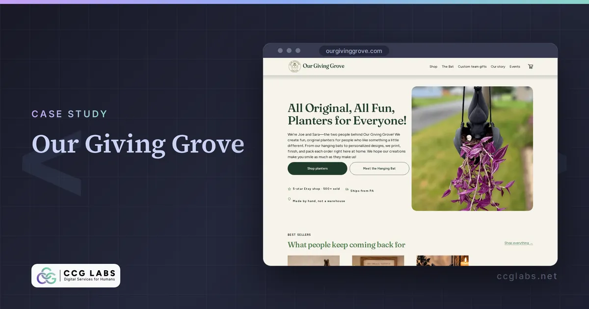
About the Client
Our Giving Grove is the brainchild of husband-and-wife team Joe and Sara of Selinsgrove, Pennsylvania, who design, print, finish, and ship some very cool and unique planters. Their bat-themed planters are the flagship product, and they also make personalized team-gift planters. They’re small, local, care about more than just profit, and are a lot of fun to work with. In other words: exactly the kind of client I was hoping to attract when I left my corporate life.
The Problem
Joe and Sara built their business on Etsy, and as is usually the case, Etsy was a great way to get started: you don’t need to put a lot of time, effort, and specialized knowledge into setting up a storefront.
But Etsy also leaves you somewhat exposed: a storefront on someone else’s platform is a sales channel at the mercy of a corporate behemoth. If they decide there’s a reason to unlist your products, you can’t do business. Joe and Sara decided they needed a digital storefront that they owned.
Joe built a storefront on Squarespace and soft-launched it to their Facebook followers. Before releasing it to a wider audience, he wanted some technical and design polish, plus a new landing page for a campaign he was about to run. He posted a call for web people on Facebook. I follow their page because I like their product, and I was lucky enough to notice.
The original site had some technical problems:
- Almost no text. The homepage had words, but they lived inside images with no
alttext or descriptions, so search engines and AI had almost nothing to read. - Slow. A design built almost entirely from images is slow to load, especially on mobile.
- Bad mobile experience. Those same images didn’t adapt to small screens, so the text inside them was hard to read when scaled down on a phone.
The Job
The goals were clear:
- Let the product photography speak for itself without harming performance
- Improve SEO by getting the technical basics correct: good titles, metadata, image descriptions, adequate page length, appropriate use of keywords, good URL naming and organization, etc.
- Improve the look and feel. Select fonts and colors that pair well with their established logo and designs, and apply them consistently across the site.
- Improve mobile usability. Use Squarespace’s mobile design mode to adjust content to flow well on mobile, and avoid layering issues.
- Add a landing page for a marketing campaign. Get a new page in place for a partner to share with their audience.
- Stay on Squarespace. At the beginning they said they wanted to stay on Squarespace. I think everyone’s feelings about this evolved as the project moved forward.
That last one was the client’s call. It posed both a challenge and an opportunity. I had never worked in Squarespace. As a trained and experienced software developer, I had always been snobby and dismissive about it. But it was a chance to help an organization I really wanted to work with, while expanding my capabilities by giving the platform an honest assessment.
The Solution
I cloned their original site so I could work without subjecting their visitors to a “work in progress.” Then I made a plan and mockups for the new one and presented them to Joe.
The new homepage was expanded considerably. It highlights their flagship products, reinforces that this is a real, handmade, two-person business, and keeps the buying journey front and center. It builds on the work Joe and Sara had already done: the designs they had baked into images became well-organized, responsive, native elements, so the content reads well on a phone and can be indexed by search engines and AI. I also built the landing page for their non-profit campaign.
Evaluating Squarespace
I came away with mixed feelings. I was honestly surprised by how “decent” the design elements are out of the box. I was frustrated by how limited and inflexible they can be. For most of those limits I found a way to work around them inside the tool, and the client got to stay on the platform they’re comfortable with.
We did run into issues in Squarespace related to e-commerce. To put it bluntly: Squarespace is not an e-commerce platform. You can create a shop, and people can buy things from it. But platforms such as WordPress/WooCommerce, Shopify, and BigCommerce have already solved the challenges that shops run into, such as:
- Flexible ways of collecting and dynamically showing customer feedback
- Flexible offer codes and sales, with control over how they interact and stack
- Flexible, dynamic product content
E-commerce in Squarespace is a clumsy instrument. In the end the e-commerce functions felt like a second-class citizen. We met today’s needs, but we could already feel some growing pains.
I also wasn’t a fan of how little Squarespace does to guide a nontechnical operator toward what I’ll call “correct technical execution.” It will happily let you upload enormous images and not optimize them for the size and scale at which they are actually shown, meaning you send users more bytes than they need and hurt performance. It will happily let you ignore alt tags, which are an important source of text content for SEO.
The Bottom Line
Joe and Sara set out to get a storefront of their own, and I think we knocked it out of the park together. It reads well on a phone, and gives search engines and AI plenty to work with. It lets the product photography do the talking while providing plenty of text content, and answering common buyer questions about their products. It’s ready to impress the new shoppers who may arrive from the campaign, too.
Will it stay on Squarespace forever? Time will tell. We agreed it made sense to date Squarespace for a while, but not marry it. The next few months of running an e-commerce shop will tell us where the platform does and doesn’t meet their needs.
As for my snobbery? I’m revising it. A bit. I can actually see how Squarespace could be a great solution for the right person. Its out-of-the-box designs are decent. What I’m less impressed with are the limitations (five color options, really?) and the fact that it’s a nontechnical tool aimed at a very technical problem, with little to warn users that they might be building a footgun.
What We Shipped
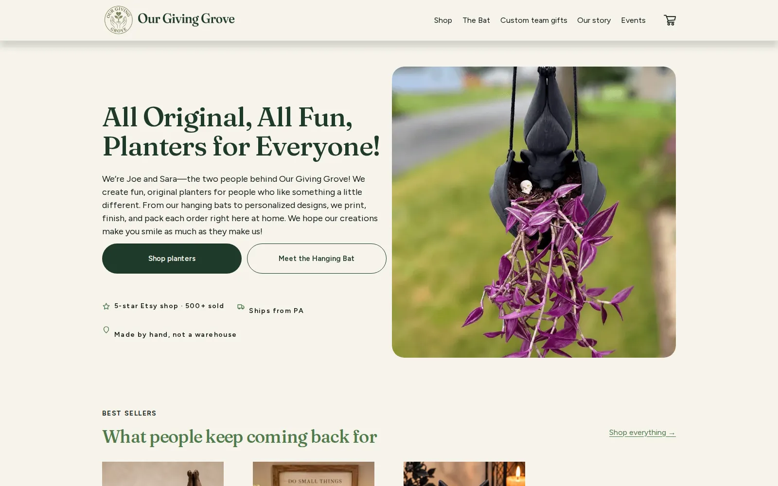
Flagship products and the buying path, up front
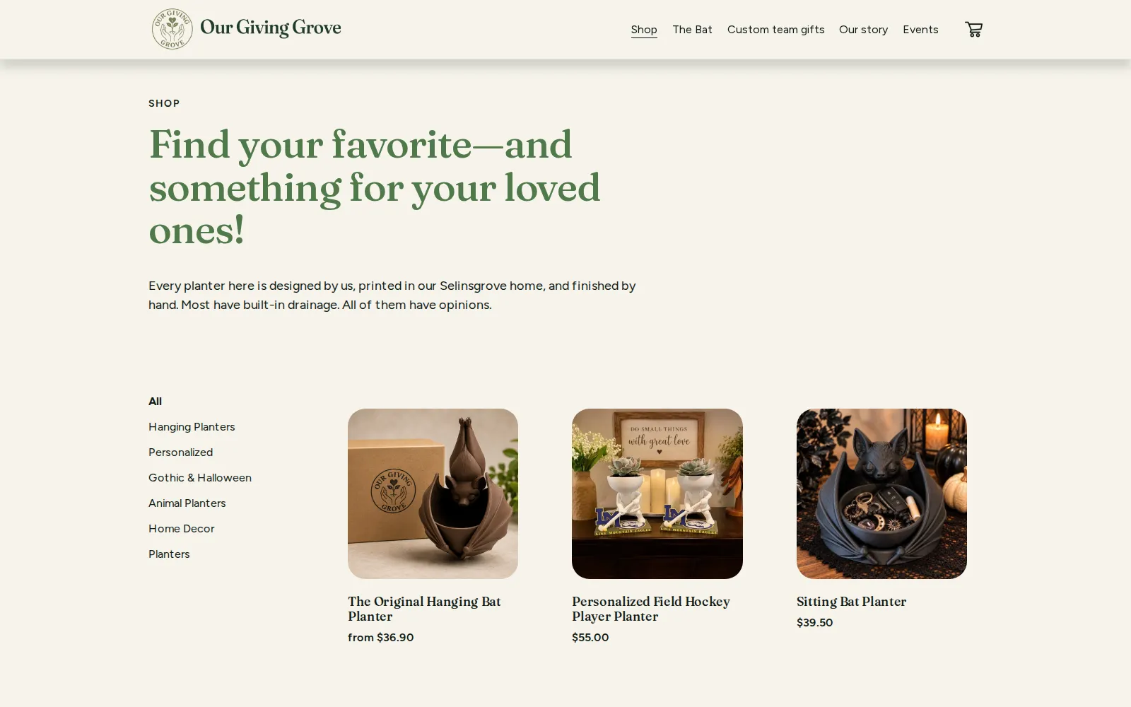
Browsable by category, built from real text
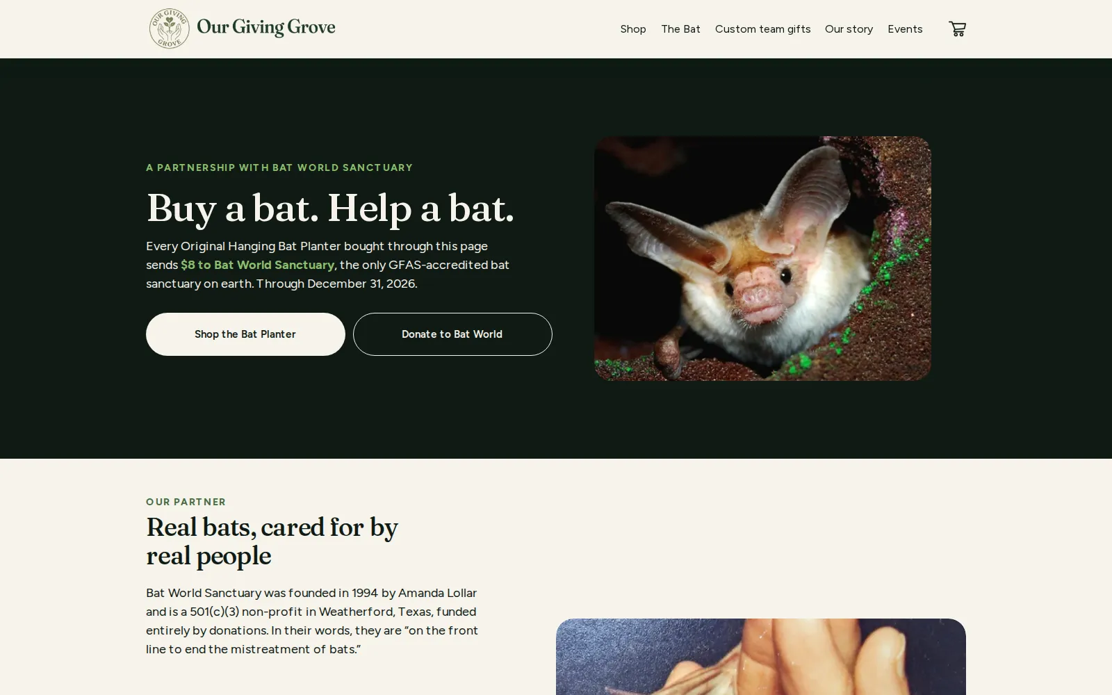
A landing page for a non-profit campaign
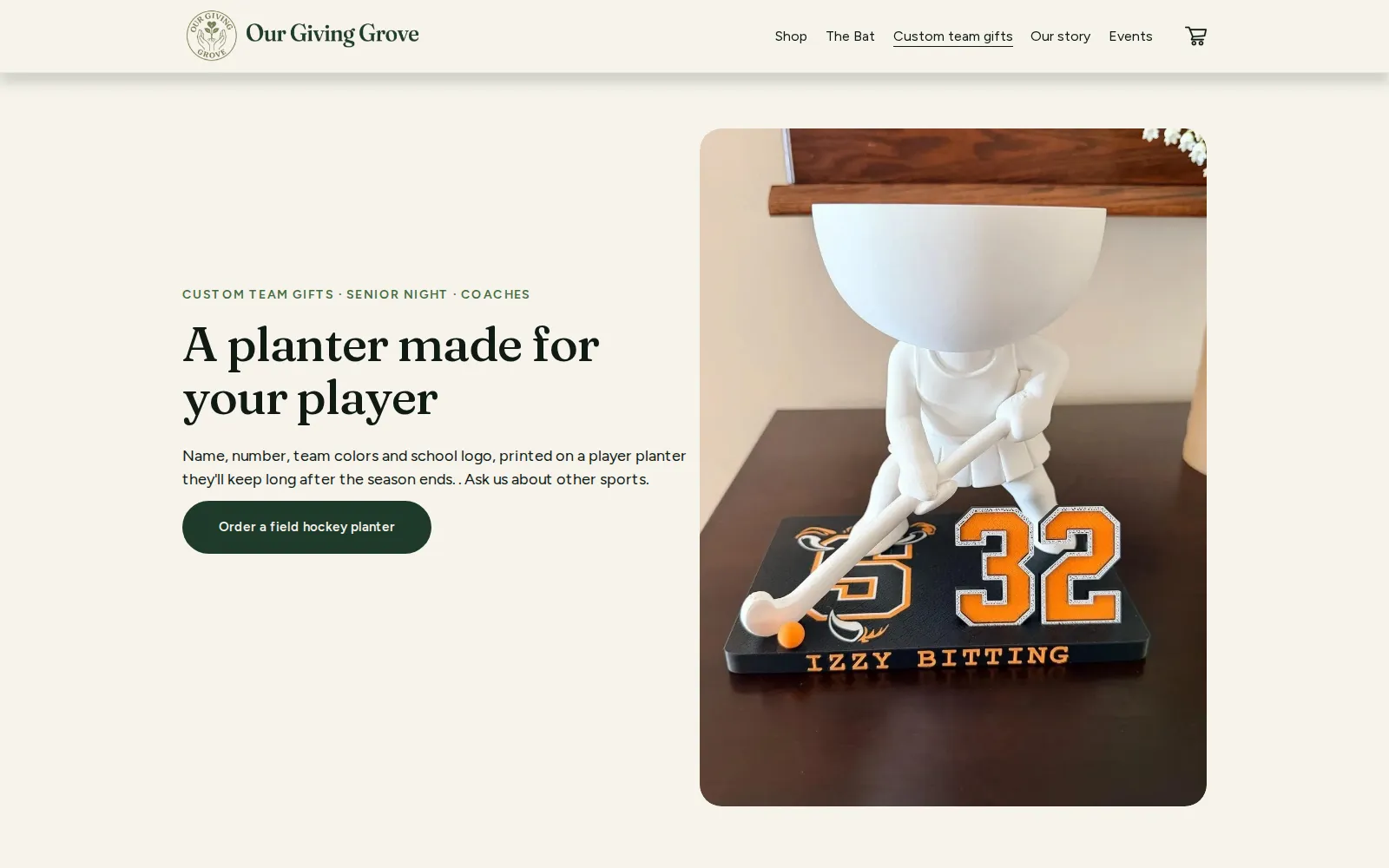
A dedicated page for custom team orders
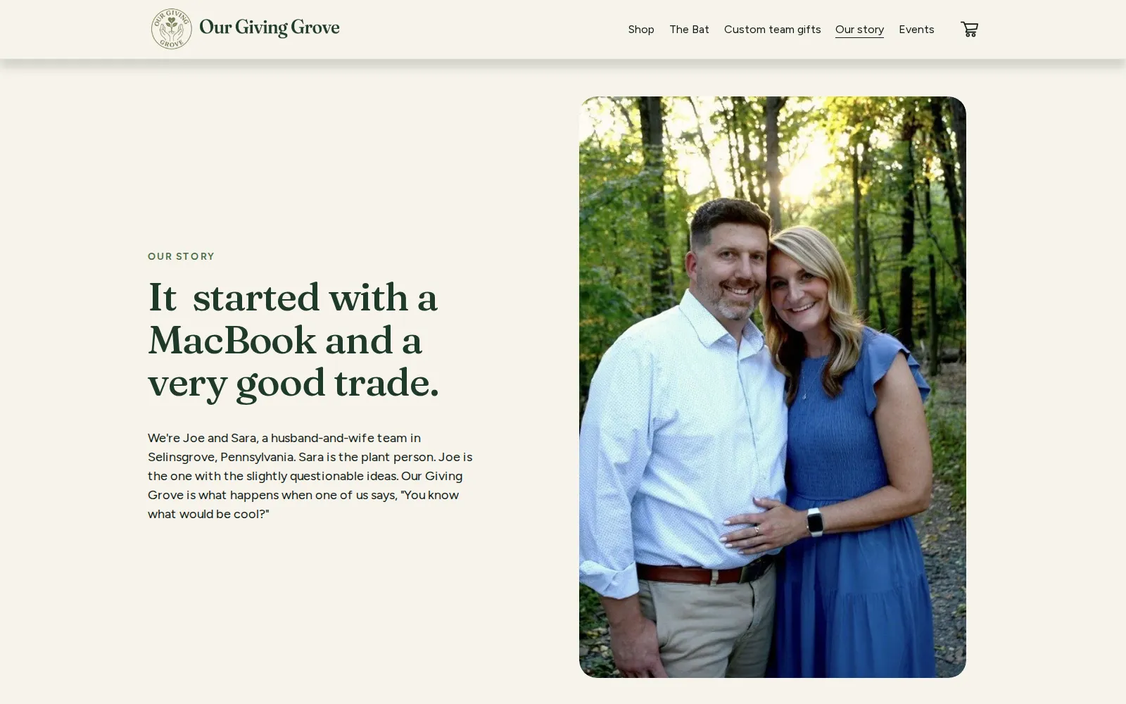
The owners' story, in their own words